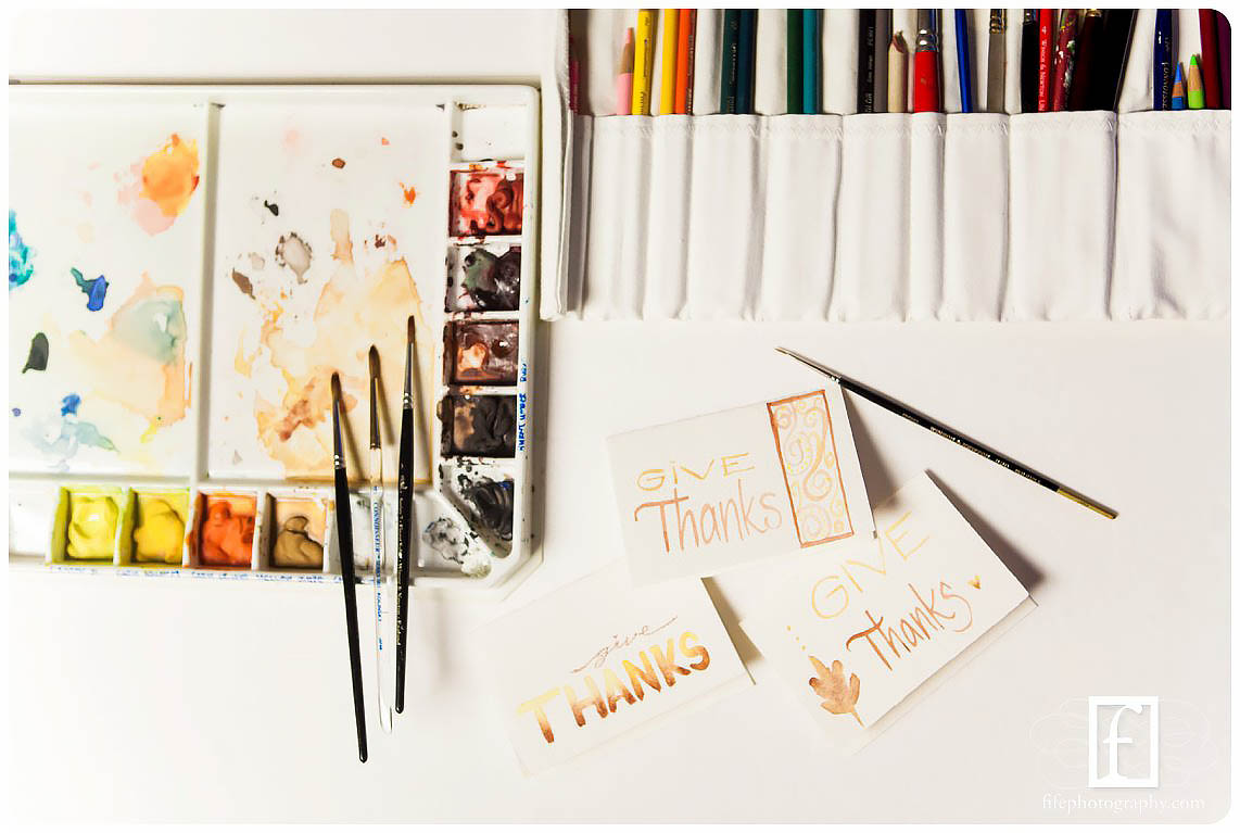
I love thanksgiving. Fall is so snuggly.
Being back in the New England area makes fall so cosy. In Oklahoma the trees forget it’s fall. But here, they are so beautiful.
Part of our church service is that we get to friendship other women.
The woman I’m paired with to friendship these women is pretty amazing. She’s whipping up some banana bread, and I get to cover the cards.
I decided to stop putting things off and just jump in the deep end and start creating.

What fall colors should i use?
Brown and yellow seem good… red might be too bright, and green might start looking springy.
Maybe toned-down green? No, keep simple color tones.

I haven’t picked up a brush in… years? But I’ve been watching people paint on instagram a lot for the last few months, that counts, right?
Actually, I did pick up a thing or two.
Card #1
I paint the shape of a leaf with pure water and drop color into it. It’s a make-believe leaf from my head alright? Don’t tell my husband. He’s a tree expert.
Drop a little yellow in so it’s not pure brown….
I’ve seen better leaves, but hey, it’s not too bad for first attempt. Now for the words.
Thanksgiving is soooooooo long. And then I’d have lots of empty space above or below… But “give thanks” is easier, and it fills the space better.
I hold my brush vertical and try a few strokes on a spare square of watercolor paper.
Deep breath.
Here it goes.
First strokes actually not bad. As the words go on I lose my spacing… the k is a bit wide and the S decides to steal the show, but whatever. I’ll let him.
Next I have a second brush with yellow, and choose a skinny wide font to span the space above thanks.
Something’s missing.
Yellow heart. Bingo.
Add a little brown at the bottom tip, so it shows up better.
And why not add a few yellow dots.
Who doesn’t love yellow dots.
Whew! First one down.

Card number 2!!
Let’s try that thanks font again… a little more even this time. Good!
Give is back too… let’s give him a heart over his “i”.
What to do with the space on the right? Let’s do a vertical banner. Of swirls.
Okay… I’ve made better swirls in my life. But we’re having fun, right?

Card 3–Only 1 to go!
This is actually getting fun!
So I want to do a thick font, but I don’t want to pull out other brushes… This one will work.
I wet my brush really well and paint with yellow, bringing my brown brush over to touch the bottom wet feet of each letter as i pass over.
Cool to watch it spread up in tiny tendrils.
T and H are so cool. Wait, i have to fit in the rest of the word.
Oops.
Skiiiiiny A, yep, we’ll be okay.
Brush not as wet for s, dry before brown brush can join. Hmmmm… wet again with yellow brush, careful to stay in line, add brown again? Bingo. Yay.
I want a skinny lowercase cursive look for give… but can I draw a delicate enough line? But i have some colored pencils that can work.
Hmmm… super bumpy watercolor paper = bad colored pencil lines.
Oh well. Little red heart just for fun.

Done!
Wow. That wasn’t as hard as I anticipated.
They actually look cute all together, in the same color palette.

So my question for you: What are YOU going to create today? It doesn’t have to be perfect, and you’ll likely be your own worst critic.
But CREATE.
Create with abandon, and don’t worry about it looking good or showing anyone. Just doodle circles or leaves or hearts. Use sharpies, crayola markers, anything.
Create.

